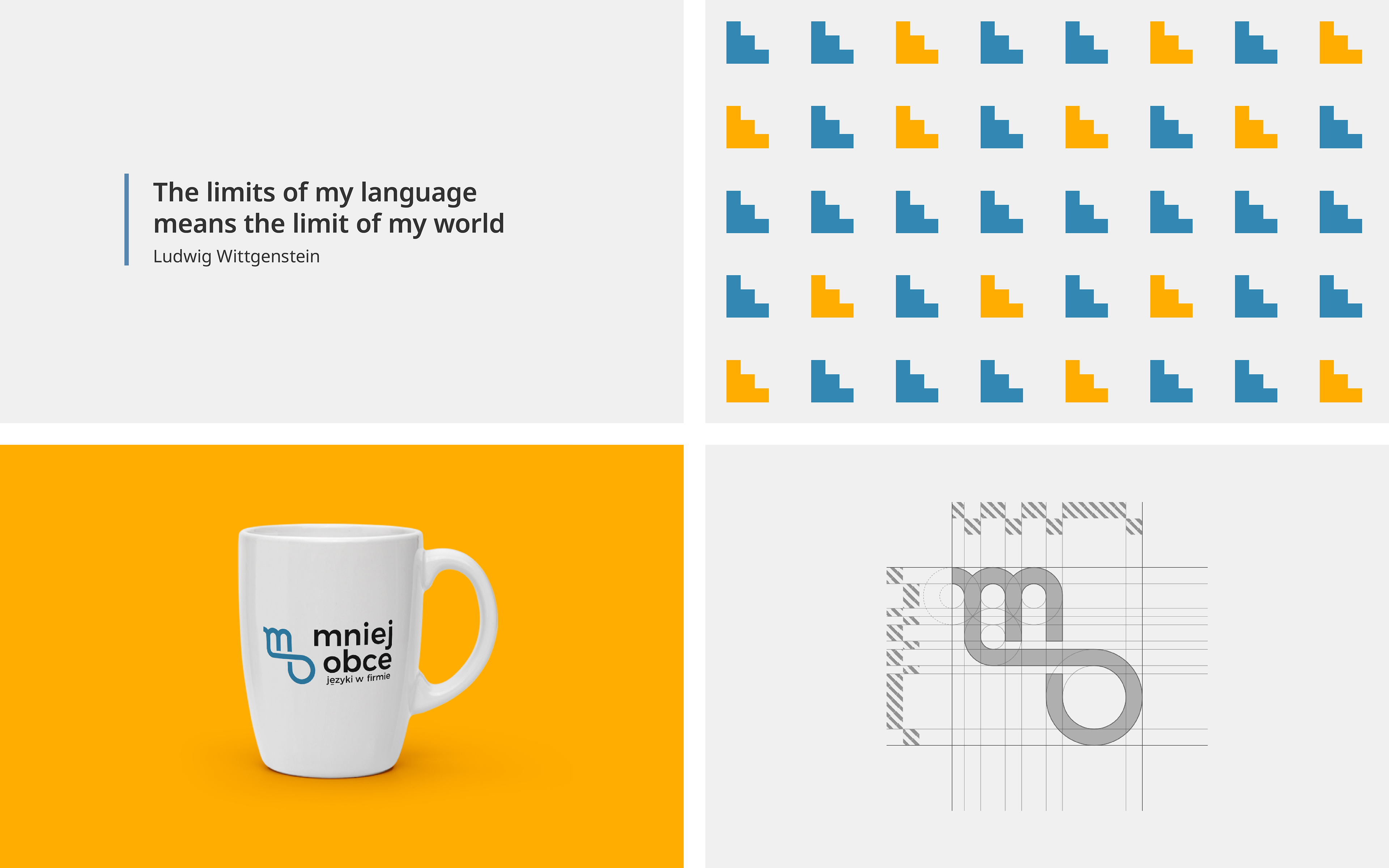
"Mniej Obce" Language School
Mniej Obce ( eng. Less foreign / more familiar ) is a language school focused on teaching business English and improving employees’ language skills. The school seeks long-term partners who value their services.
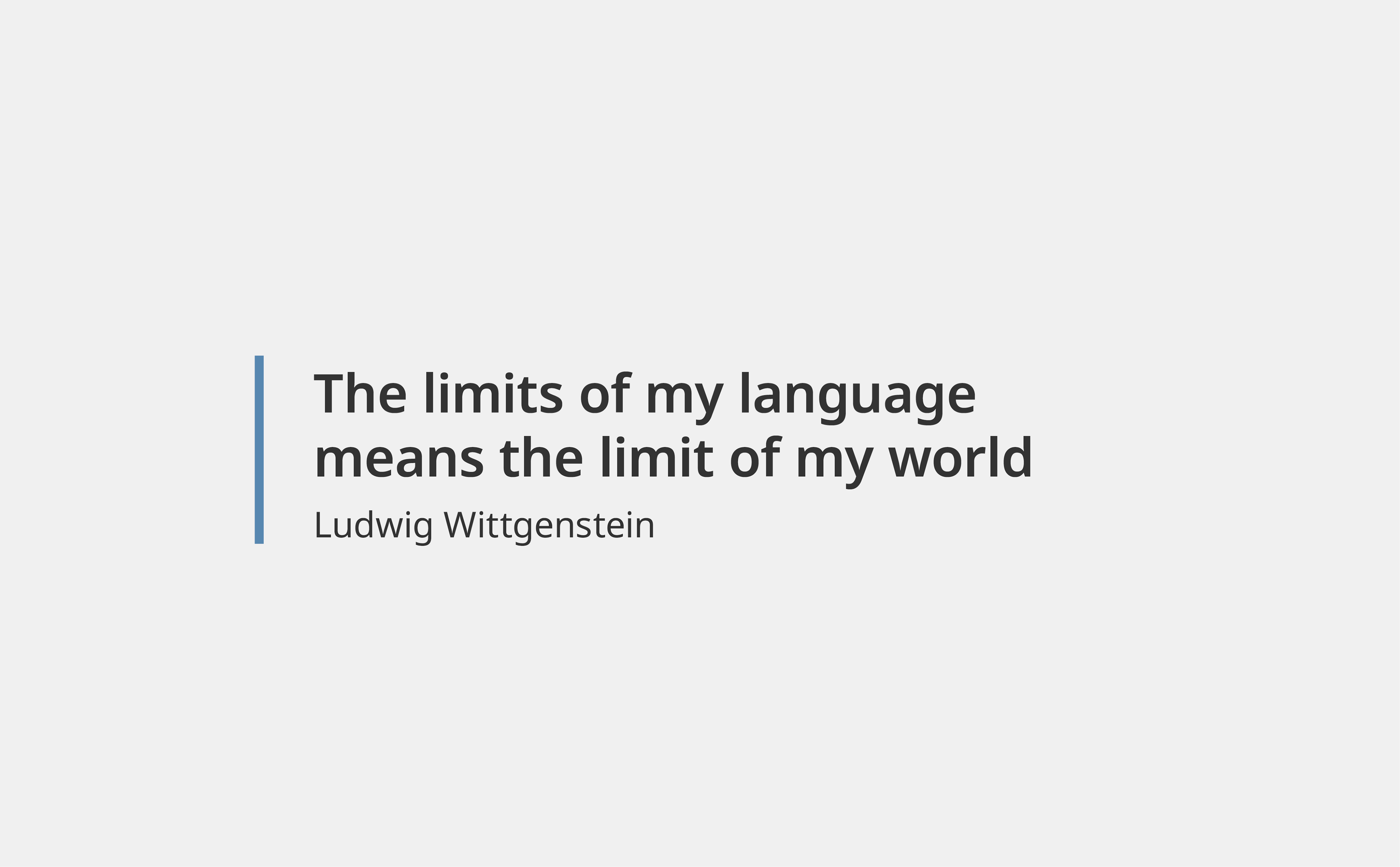
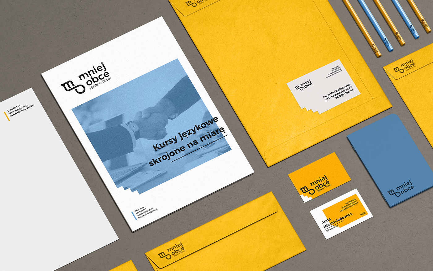
BRIEF: With years of experience and unique teaching methods, the school’s offer was exceptional. However, they struggled with being memorable among the other language schools, so they decided to invest in their visual identity. The goal was to design a vibrant and recognizable brand with a welcoming and professional tone of voice.
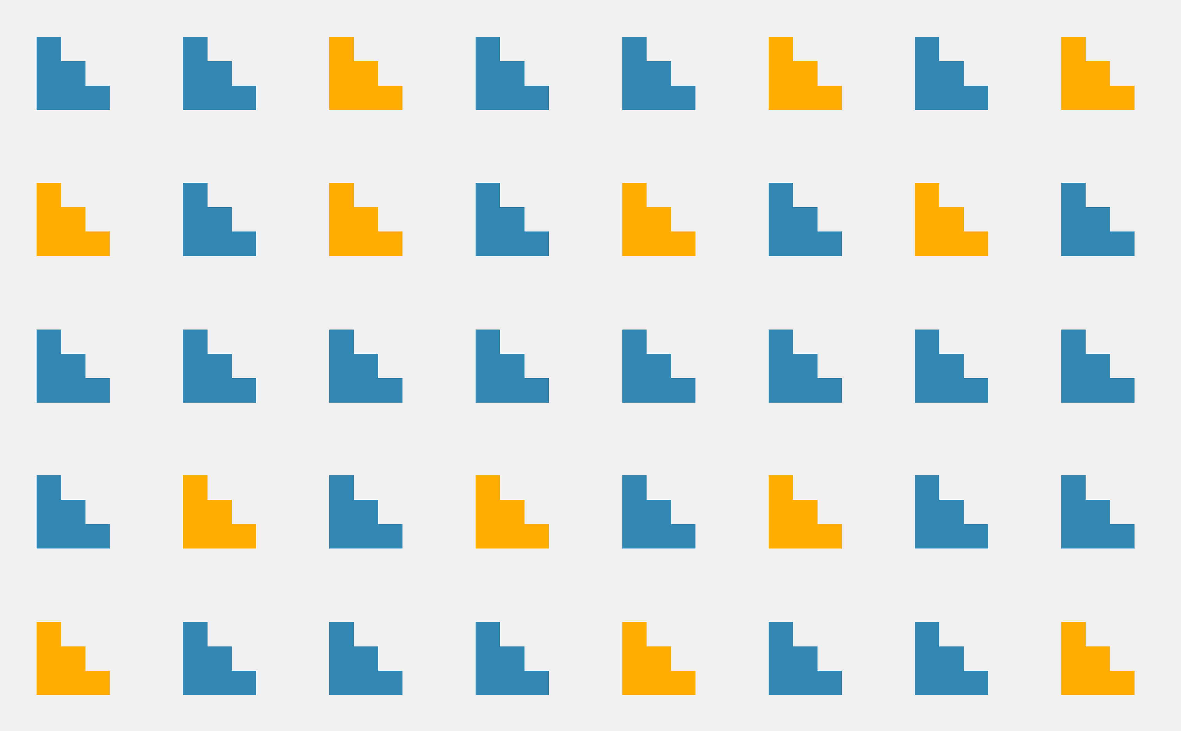
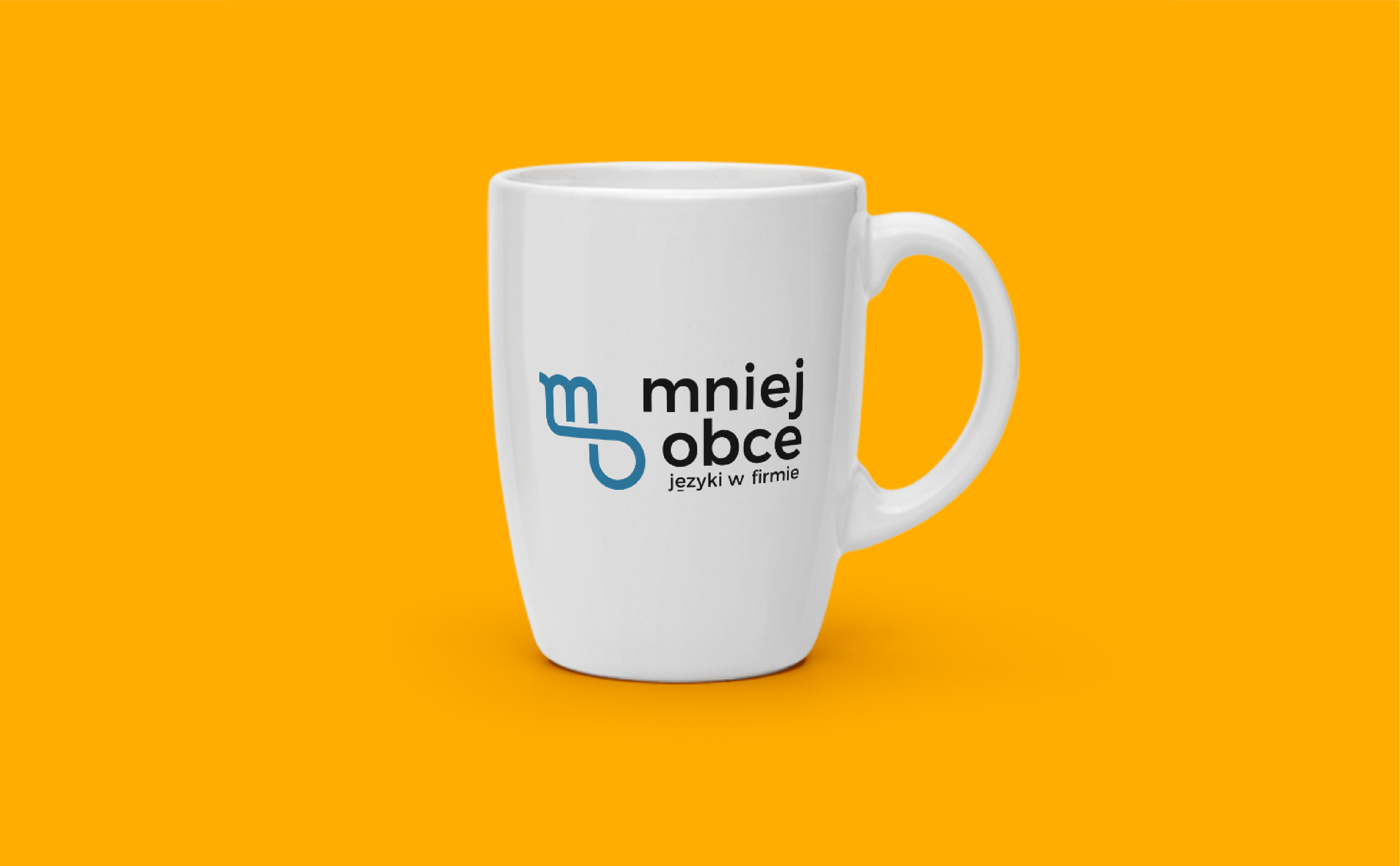
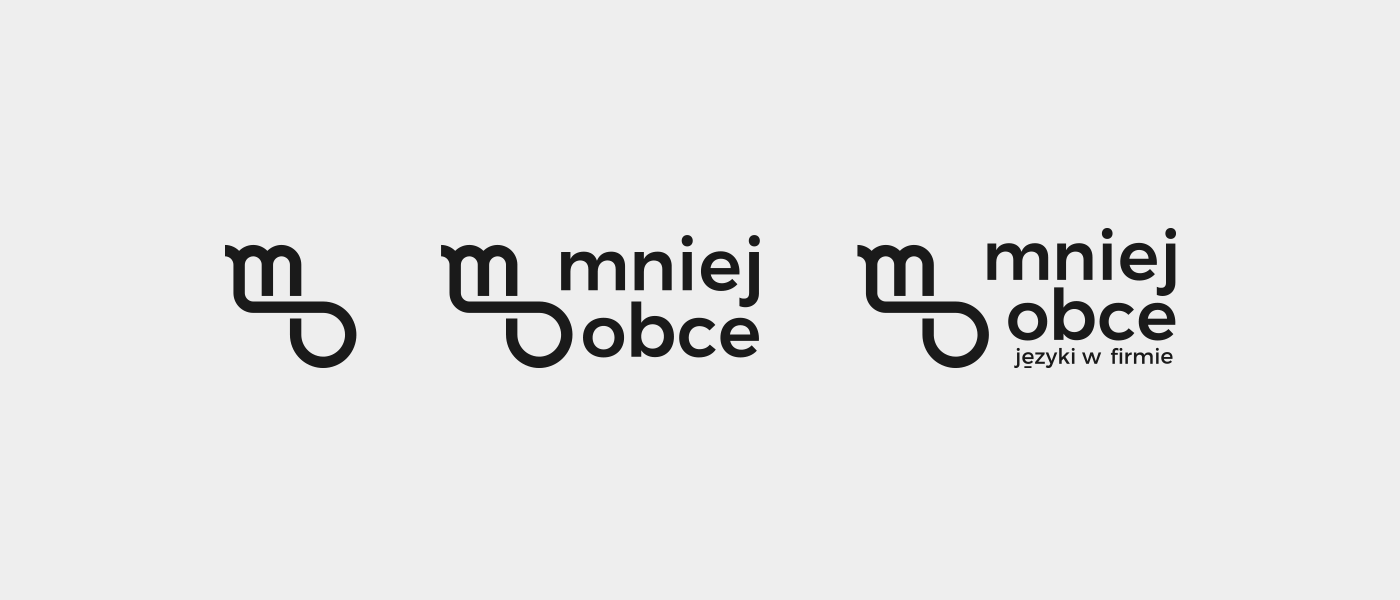
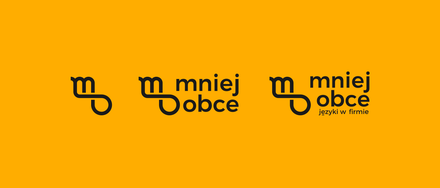
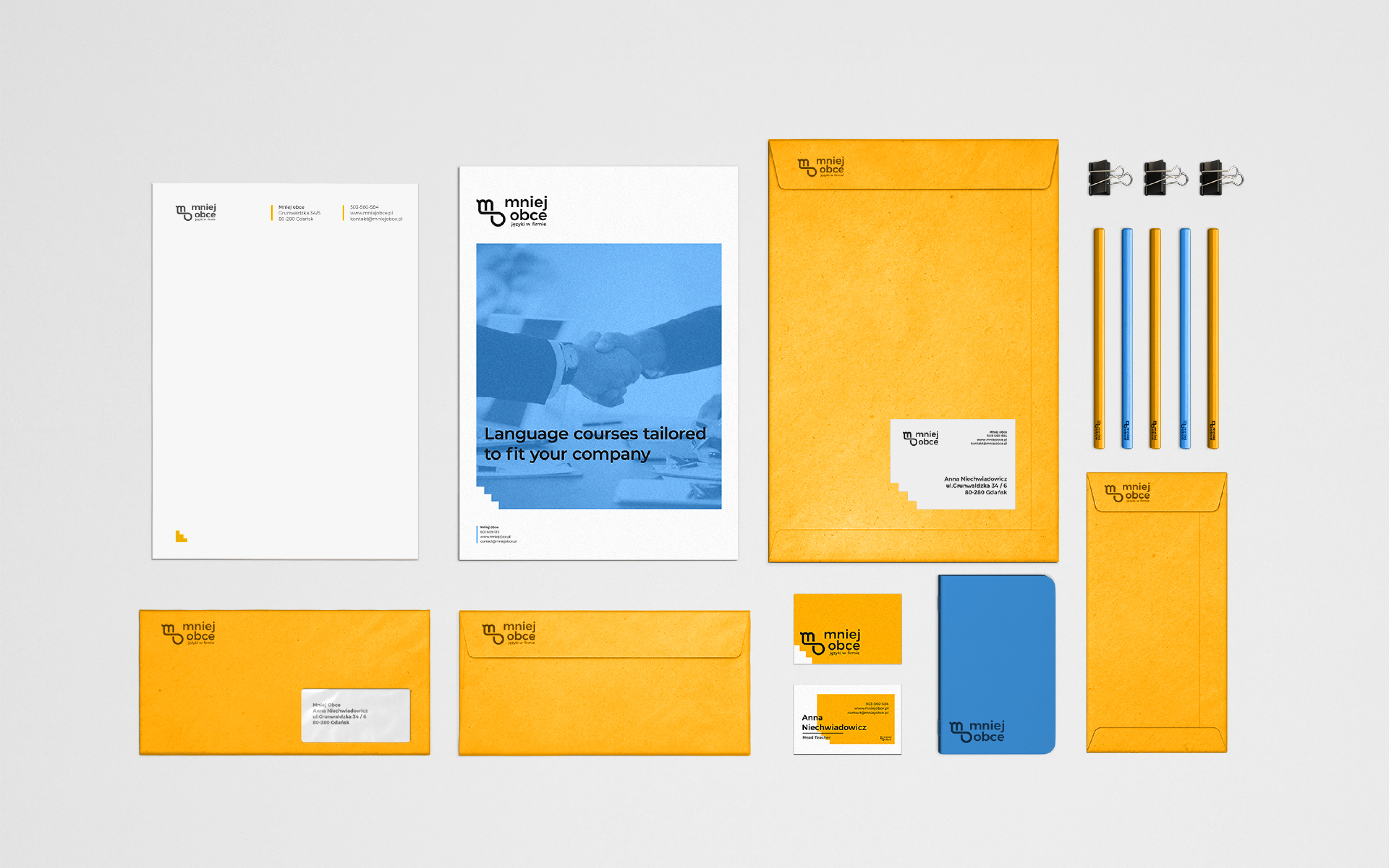
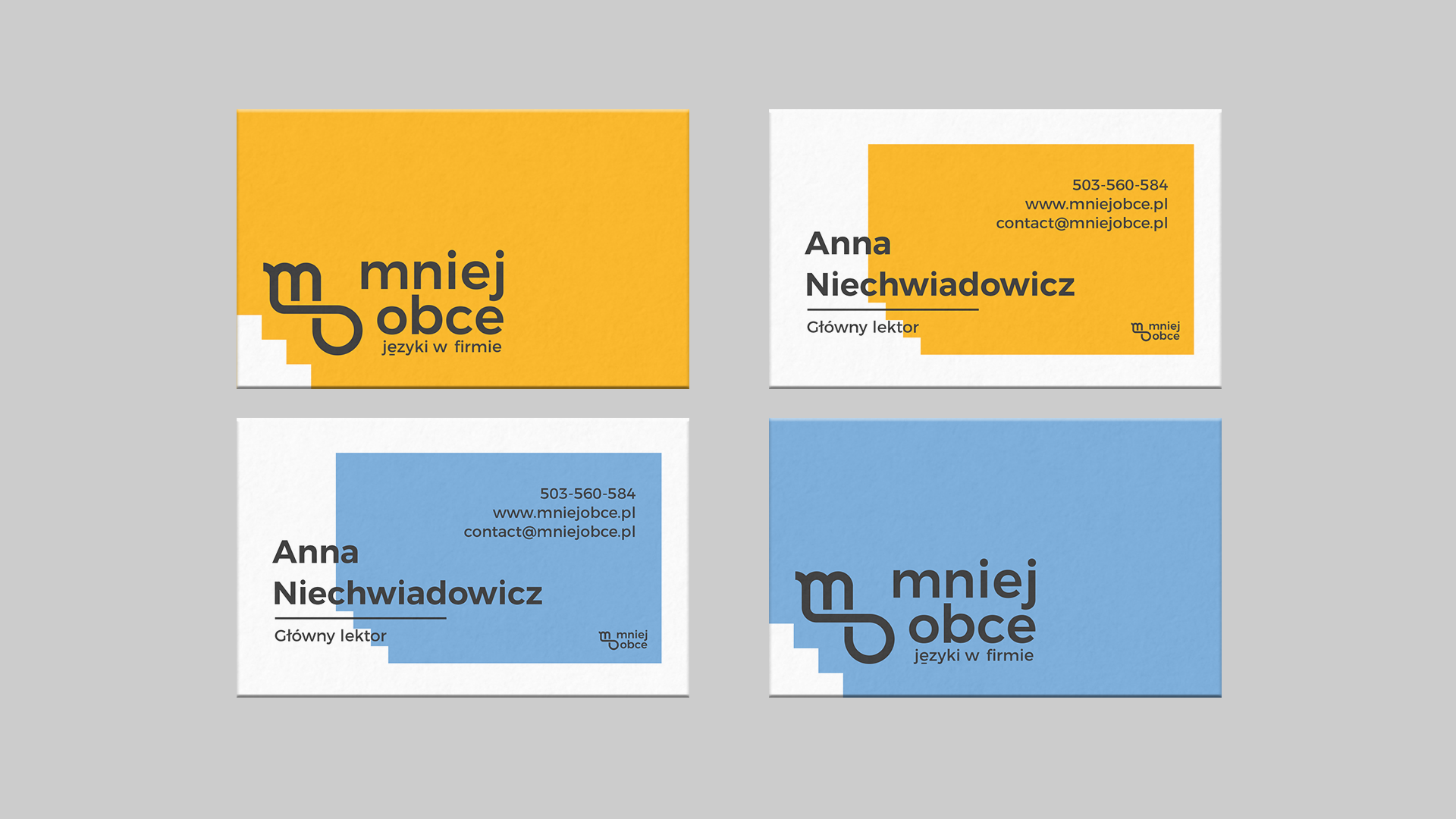
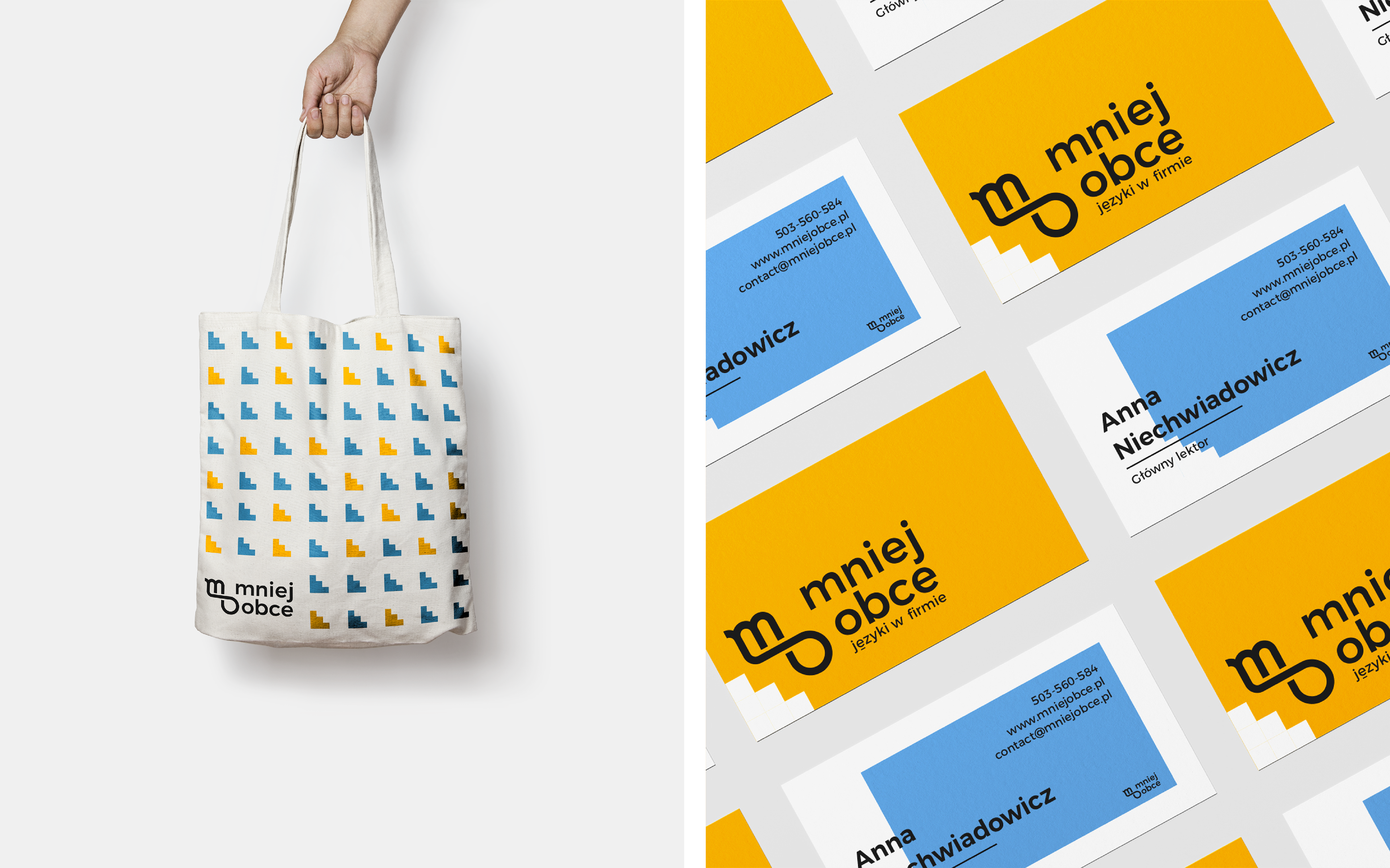
SOLUTION: In order to meet the client’s needs I decided to rely upon strong, vibrant colors and simple, easily recognizable shapes. The combination of yellow & blue was very playful and the stair-shaped key visual was memorable and intriguing. Together, these elements made up the core of the design. The logo on the other hand was slick & elegant, showing a more sophisticated side of the project.
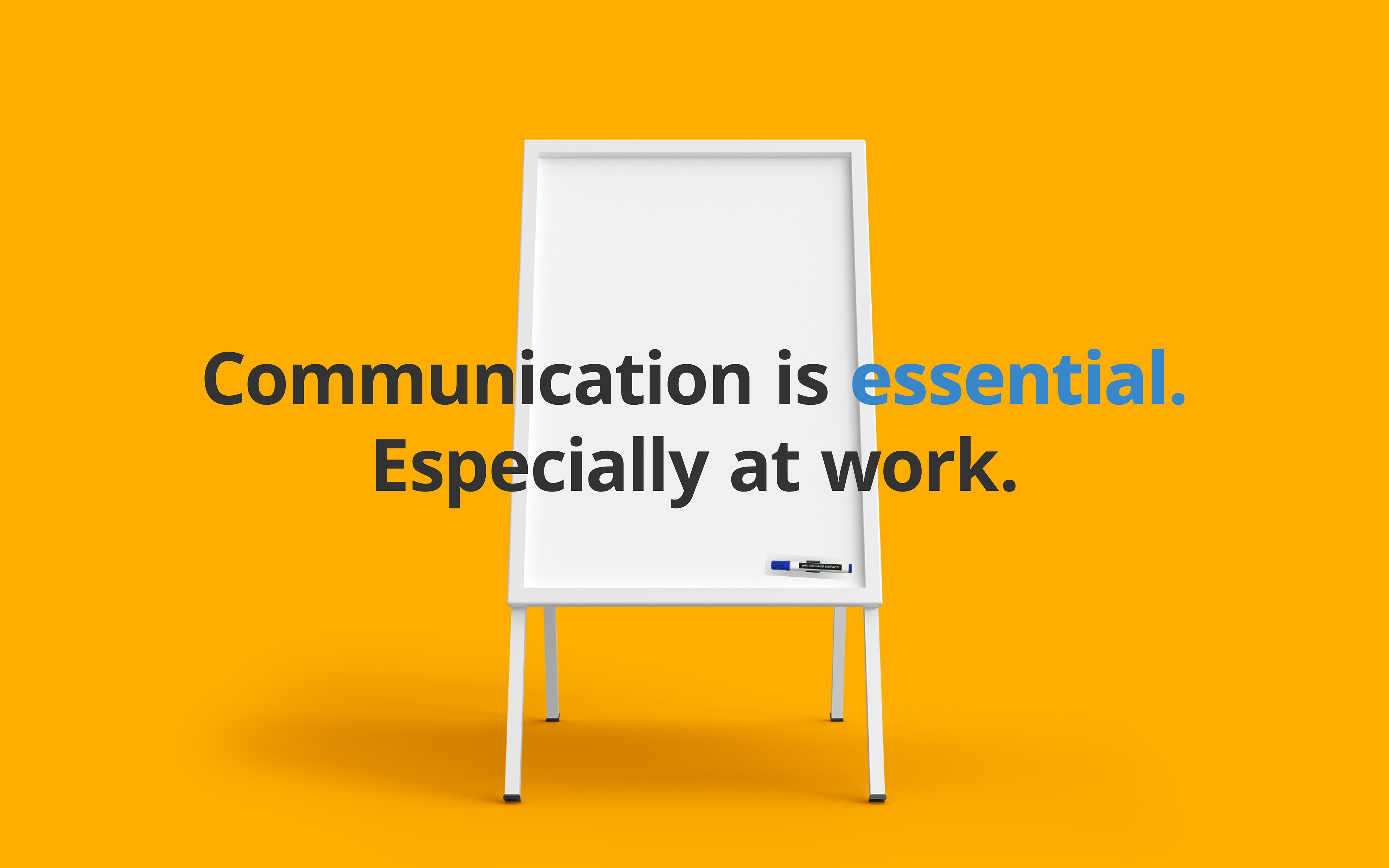
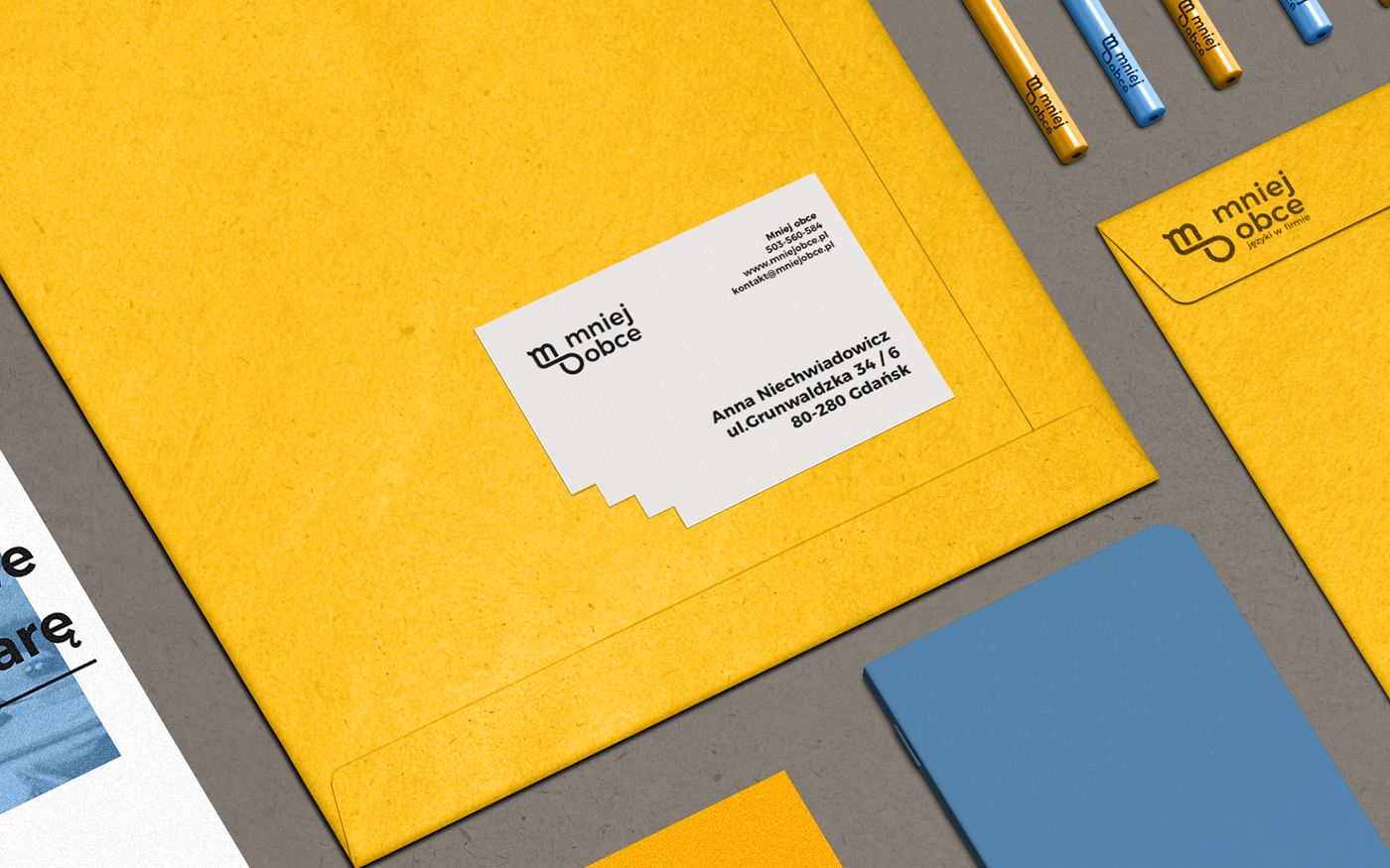
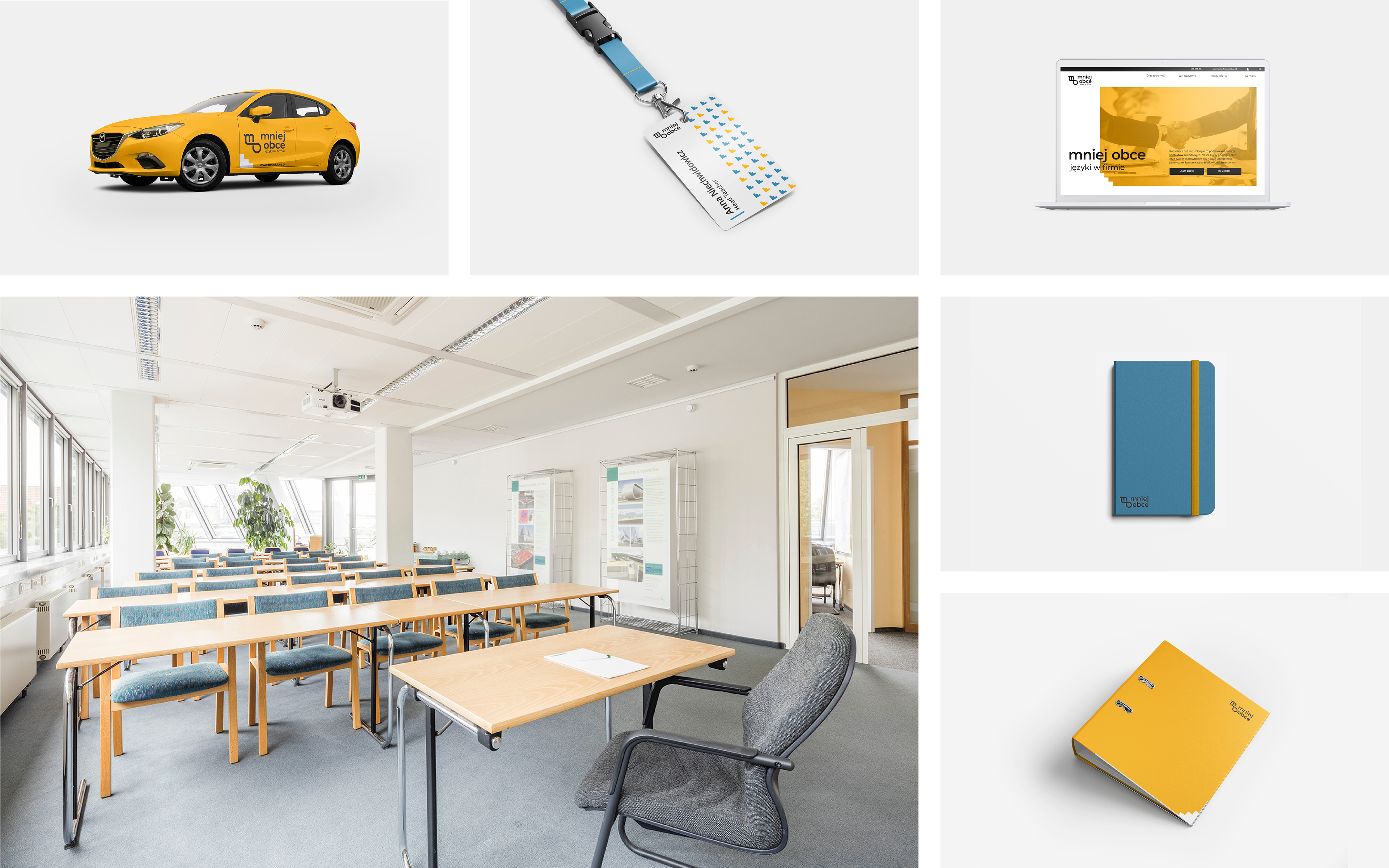
APPLICATION: I have decided to limit the use of photography and keep the designs minimalist. This way, the colours create the desired welcoming tone while the ascetic form emphasizes the professional voice.